
I have been a long term fan of Sanjay Matange and Dan Heath when it comes to the SAS graph template language or GTL. I was lucky enough to have met these two individuals in person at the 2018 SAS Global Forum in Denver and talk about some of the GTL features. Be sure to check out their SAS blog Graphically Speaking.
GTL is a unique language with its own syntax that shares very little if anything from the SAS foundation language. However, this is a very powerful piece of software that should not be overlooked.
The above image provides a great sample of what GTL can do. In this case, I am using the SAS supplied SASHELP.HEART data set containing 5,209 observations and creating a histogram along with a subordinate fringe plot of the same data. The top left area of the graph is used to display textual values of key statistical measures. Below the histogram and taking up just 15% of the area is a horizontal box plot.
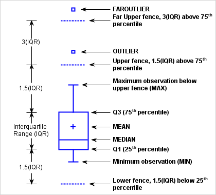
While a histogram breaks data into bins, a boxplot (aka box and whiskers) is a visual representation of key statistical values. Inside the box is a vertical line that reveals the median while the diamond shape is the mean. The range of the box is from the first quartile or 25th percentile to the third quartile or 75th percentile. The vertical bar on each end is set at the min/max value or the Q1/Q3 value plus 1.5 * the interquartile range. Values beyond that range are true outliers. See below.
All the code to generate and look over is included below. The key things to understand is that a template is made using define statgraph. Once the template has been created it is referenced along with the data set and rendered using proc sgrender.
proc template;
  define statgraph distribution;
    dynamic
      VAR
      VARLABEL
      NORMAL
      TITLE1
    ;

    begingraph;
      entrytitle TITLE1;
      layout lattice /
        columns         = 1
        rows            = 2
        rowgutter       = 2px
        rowweights      = (.85 .15)
        columndatarange = union
      ;

        columnaxes;
          columnaxis /
            label   = VARLABEL
            display = (ticks tickvalues label);
        endcolumnaxes;

        layout overlay /
          yaxisopts = (
          offsetmin   = .035
          griddisplay = on);

          layout gridded /
            columns   = 2
            border    = true
            autoalign = (topleft topright);

            entry halign = left "Nobs";
            entry halign = right eval(strip(put(n(VAR), comma6.)));
            entry halign = left "Min";
            entry halign = right eval(strip(put(min(VAR), comma6.)));
            entry halign = left "Q1";
            entry halign = right eval(strip(put(q1(VAR), comma6.)));
            entry halign = left "Median";
            entry halign = right eval(strip(put(median(VAR), comma6.)));
            entry halign = left "Mean";
            entry halign = right eval(strip(put(mean(VAR), comma6.)));
            entry halign = left "Q3";
            entry halign = right eval(strip(put(q3(VAR), comma6.)));
            entry halign = left "Max";
            entry halign = right eval(strip(put(max(VAR), comma6.)));
            entry halign = left "StdDev";
            entry halign = right eval(strip(put(stddev(VAR), comma6.)));
            entry halign = left "IQR";
            entry halign = right eval(strip(put(qrange(VAR), comma6.)));
          endlayout;

          histogram VAR / scale = percent;
          if (exists(NORMAL))
            densityplot VAR /
              normal()
              name        = 'norm'
              legendlabel = 'Normal'
            ;
            densityplot VAR /
              kernel()
              name        = 'kern'
              legendlabel = 'Kernel'
              lineattrs   = (
                color    = red
                pattern  = dash
              );
          endif;

          fringeplot VAR / datatransparency = .7;

          discretelegend "norm" "kern" /
            location  = inside
            across    = 1
            autoalign = (topright topleft)
            opaque    = true;
        endlayout;

        boxplot y = VAR / orient = horizontal;
      endlayout;
    endgraph;
  end;
run;

proc sgrender data = sashelp.heart template = distribution;
  dynamic var      = "systolic"
          varlabel = "Systolic"
          normal   = "yes"
          title1   = "Systolic Blood Pressure"
  ;
run;