I wanted to create a robust histogram to display the response time of a web site. To make a histogram you need to create your own statgraph using the Graphic Template Language (GTL). This requires a lot of research to see what is needed to make it all happen. Below is an image of the end result.

I received some excellent assistance from Lelia at SAS technical support to add the percent sign (%) on the Y axis. This was accomplished by creating a custom format then assigning it to tickvalueformat= option inside linearopts=().
You will see within the proc template code that I am using a vertical reference line to denote the 2.5 second boundary. Each of the bars cover an area between 0.5 above and below the center point. For example, the value 2 has a range of 1.5 to 2.5.
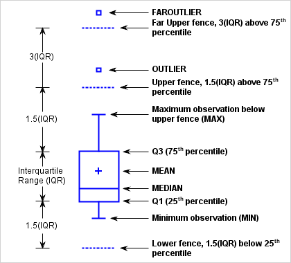
A bunch of summary statistics are handled in GTL by using the eval() function. Below the histogram is a fringeplot that shows the activity of hits by time period. A normal distribution curve was added using the densityplot syntax. Under the fringeplot is a horizontal boxplot that shows the spread of the data in a different fashion than the histogram.
The frequency procedure was used to obtain the percentages for each bar in the display. Here is the SAS data set that was created from the proc freq call.

The final piece I wanted was to display the actual bin values above the bars in the histogram. There are no options to do this using GTL but SAS does support the inclusion of an annotated (sganno) data set. With help from SAS tech support I was able to accomplish that last wish list item resulting in what I call a very robust histogram.
I used a random function (call streaminit with rand()) to create simulated data and suppressed values that exceeded 1.75. The rounded duration value was used with proc freq to drive the annoated data set to populate the values above the bars and the reference line.
The proc template code is very much reusable and is used by proc sgrender to create the output. You will notice that I am writing to the WORK folder via ODS HTML5.
proc format;
   picture mypct (round)
   low - high='009%';
run;

proc template;
  define statgraph distribution;
    dynamic
      VAR
      VARLABEL
      TITLE
      NORMAL
      fmt
    ;
    mvar pct2secs;

    begingraph;
      entrytitle TITLE;
      layout lattice /
        columns         = 1
        rows            = 2
        rowgutter       = 2px
        rowweights      = (.9 .1)
        columndatarange = union
      ;

        columnaxes;
          columnaxis /
            label      = VARLABEL
            display    = (ticks tickvalues label)
            type       = linear
          ;
        endcolumnaxes;

        layout overlay /
          yaxisopts = (
            offsetmin   = .035
            offsetmax   = .065
            griddisplay = on
            linearopts = (tickvalueformat = mypct4.)
          )

          xaxisopts = (label = "Duration in Seconds");
          referenceline x = 2.5 /
            lineattrs          = (color = red pattern = dash)
            curvelabel         = pct2secs
            curvelabellocation = outside
          ;

          layout gridded /
            columns   = 2
            border    = true
            autoalign = (topleft topright)
          ;
            entry halign = left "Nobs";
            entry halign = right eval(strip(put(n(VAR), comma12.)));
            entry halign = left "Min";
            entry halign = right eval(strip(putn(min(VAR), '12.3')));
            entry halign = left "Q1";
            entry halign = right eval(strip(putn(q1(VAR), '12.3')));
            entry halign = left "Median";
            entry halign = right eval(strip(putn(median(VAR), '12.3')));
            entry halign = left "Mean";
            entry halign = right eval(strip(putn(mean(VAR), '12.3')));
            entry halign = left "Q3";
            entry halign = right eval(strip(putn(q3(VAR), '12.3')));
            entry halign = left "Max";
            entry halign = right eval(strip(putn(max(VAR), '12.3')));
            entry halign = left "StdDev";
            entry halign = right eval(strip(putn(stddev(VAR), '12.3')));
            entry halign = left "IQR";
            entry halign = right eval(strip(putn(qrange(VAR), '12.3')));
          endlayout;

          histogram VAR /
            scale     = percent
            binwidth  = 1
            dataskin  = gloss
          ;
          annotate / id='label';

          if (exists(NORMAL))
            densityplot VAR /
              normal()
              name        = 'norm'
              legendlabel = 'Normal'
            ;
          endif;

          fringeplot VAR / datatransparency = .7;

          discretelegend "norm" "kern" /
            location  = inside
            across    = 1
            autoalign = (topright topleft)
            opaque    = true
          ;
        endlayout;

         boxplot y = VAR / orient = horizontal;
     endlayout;
   endgraph;
  end;
run;


data hitsinseconds;
  call streaminit(123);       /* set random number seed */
  do _n_ = 1 to 2000;
    duration = round(7 * rand("Uniform"), .001);
    if duration > 1.75 then do;
      if rand("Uniform") > .05 then continue;
    end;
    Seconds = round(duration, 1);
    output;
  end;
run;

proc freq data = hitsinseconds noprint;
  table seconds / out = hitfreq outcum;
run;

data sganno;
  retain id 'label';
  set hitfreq;
  drawspace = 'datavalue';
  function  = 'text';
  x1        = seconds;
  y1        = percent;
  label     = cats(put(percent, 7.2), '%');
  textcolor = 'black';
  textsize  = 8;
  anchor    = 'bottom';
  if seconds = 2 then call symputx('pct2secs', cats(put(cum_pct, 8.), '%'));
run;

ods listing close;
ods graphics on / width = 640px height = 480px;
ods html5
  path = "%sysfunc(pathname(work))"
  file = "histogram.html"
  style = seaside
;

  title;
  proc sgrender
    data     = hitsinseconds
    template = distribution
    sganno   = sganno
  ;

    dynamic
      var      = "duration"
      varlabel = "Time in Seconds"
      normal   = "yes"
      title    = "&pct2secs of hits were under 2.5 seconds"
    ;

    format duration 8.1;
  run;
ods html close;